Stylish text and symbols can transform a simple name into something more distinctive. A plain username such as Nova can look completely different when combined with decorative lettering, stars, brackets, dots, or other Unicode characters.
The challenge is knowing when to stop.
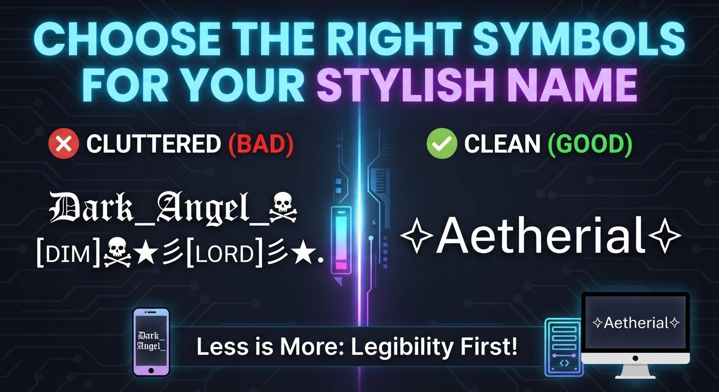
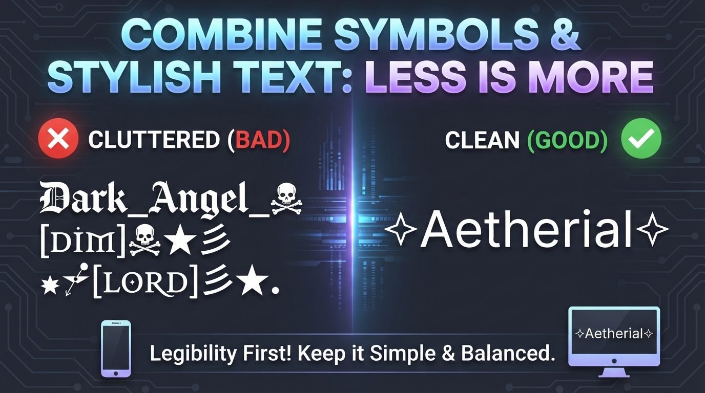
Using one or two design elements can make a name look polished, while combining too many fonts, symbols, and unusual characters can make it difficult to read. A name that was meant to look stylish can quickly become crowded, confusing, or impractical.
The best approach is to treat stylish text and symbols as complementary elements. The text should remain the main focus, while the symbols add a small amount of personality.
Read also: → Crown Symbol for Nickname: 19 Verified Crown & Royal Symbols
Start With Plain Text
Before adding any decoration, write the name in its simplest form.
For example:
Nova
Shadow
Luna Star
PixelKing
This gives you a clear starting point.
Once you can see the original name, you can decide which part needs styling. Sometimes the letters themselves are enough. Other times, a symbol around the name creates the effect you want.
Starting with plain text also prevents you from adding decorations simply because they are available.
Choose One Main Visual Style
A stylish name usually looks better when it has one dominant design idea.
You might choose:
- Decorative lettering
- A bold Unicode style
- A simple symbol
- A framed appearance
- A minimalist design
For example, you could turn Nova into:
𝓝𝓸𝓿𝓪
and leave it without additional decoration.
Or you could keep the letters simple and use:
★ Nova ★
Both approaches create a style without competing elements.
When you use decorative text and symbols together, decide which one should attract attention first.
Use Symbols as Supporting Elements
Symbols should generally support the name rather than overpower it.
For example:
★ Nova ★
has a clear visual hierarchy. The name is still the main element, while the stars provide decoration.
Another example is:
『Shadow』
The brackets frame the word without interrupting it.
Compare that with a heavily decorated combination containing several different symbols before and after every letter. The second version may be more complicated, but complexity does not automatically make a name more attractive.
Avoid Mixing Too Many Stylish Fonts
One common mistake is using several different text styles in the same name.
For example, a name might contain:
- Bold decorative letters
- Script letters
- Small superscript characters
- Circled characters
- Multiple symbol sets
Each style may look interesting individually, but combining them can create visual confusion.
Instead, choose one main text style.
For example:
𝓝𝓸𝓿𝓪 ★
is easier to understand than a name where every letter uses a different decorative style.
Consistency makes the design feel intentional.
Pair Simple Text With Decorative Symbols
If you want to use several symbols, keeping the letters relatively simple can create balance.
For example:
★ Nova ✦
or:
『Nova』
The symbols provide visual interest while the letters remain easy to recognize.
This can be especially useful for people who want a stylish gaming or social media name but do not want heavily decorated Unicode lettering.
Pair Stylish Text With Minimal Symbols
The opposite approach can work just as well.
If your text already has a strong visual style, use fewer symbols.
For example:
𝓝𝓸𝓿𝓪 ✦
or:
★ 𝑵𝒐𝒗𝒂
The decorative letters already provide most of the visual effect. Adding several additional symbols could make the name unnecessarily busy.
A useful principle is simple: the more decorative the text becomes, the less decoration it may need around it.
Use Matching Symbols
If you place symbols on both sides of a name, matching them can create a balanced appearance.
Examples include:
★ Nova ★
✦ Luna ✦
♡ Dreamer ♡
『Raven』
【Shadow】
Matching symbols create a visual frame around the text.
You can also use related symbols:
★ Nova ✦
This can work when the two symbols have a similar visual weight.
Be Careful With Symbol Combinations
Not every symbol combination looks good together.
For example, using stars, hearts, flowers, diamonds, brackets, arrows, and decorative lines around the same name can create too many competing shapes.
Instead of:
★♡✦『Nova』✿◆
try something more controlled:
★Nova★
or:
『Nova』
The simpler version may actually look more distinctive because the viewer can immediately recognize the name.
Think About Visual Weight
Some characters naturally attract more attention than others.
A large decorative bracket can have more visual weight than a small dot. A bold Unicode letter can stand out more than a simple star.
If both your text and symbols are visually strong, the result can feel crowded.
For example, heavily stylized text surrounded by large decorative characters may leave very little visual space.
Balance can be achieved by pairing:
- Heavy text with light symbols
- Simple text with stronger symbols
- Long names with minimal decoration
- Short names with slightly more decoration
This does not require strict rules. The goal is simply to look at the entire name rather than each character separately.
Consider the Length of Your Name
Long names usually need less decoration.
For a short name such as:
Kai
you might use:
★Kai★
For a longer name such as:
DarkShadowPlayer
the same amount of decoration can make the name look much heavier.
A cleaner version could be:
DarkShadowPlayer★
or:
『DarkShadowPlayer』
The longer the name becomes, the more useful simplicity can be.
Remember That Unicode Styles Are Not Traditional Fonts
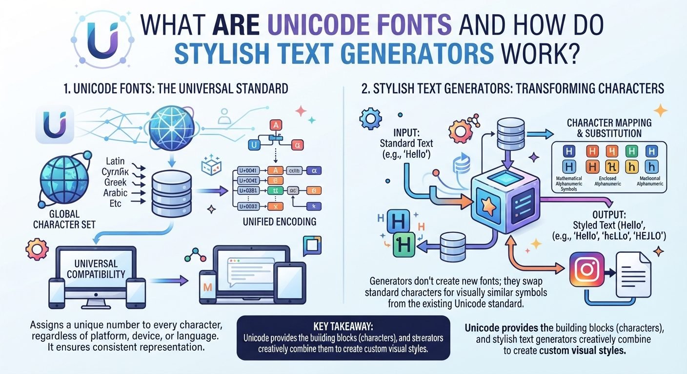
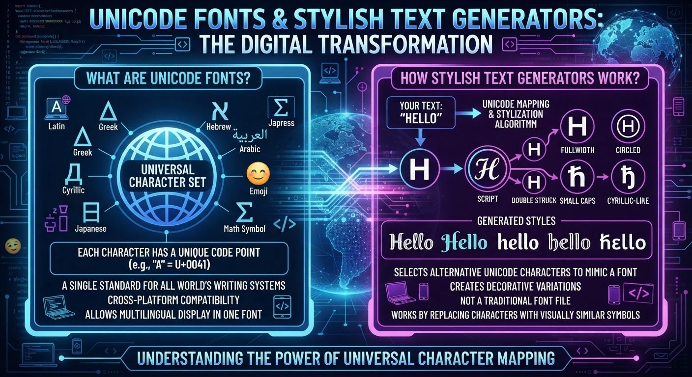
Many stylish text generators use Unicode characters rather than changing the font of ordinary text.
For example, a generator may turn:
Nova
into characters that look like:
𝓝𝓸𝓿𝓪
These are different Unicode characters, not simply a new font applied to the original letters.
This matters because different platforms and devices may display those characters differently.
Adding symbols on top of decorative Unicode text can increase the complexity of the final result, so testing is important.
Think About the Platform
Different websites and applications have different rules for names and usernames.
Some allow decorative Unicode characters in display names but restrict usernames. Others may accept a particular symbol while rejecting another.
A stylish combination might therefore work in one place but not another.
Before committing to a design, check whether the complete name is accepted.
This is especially important if you want to use the same identity on several platforms.
Keep a Plain Version
It is useful to remember your original name without decoration.
For example:
Stylish version:
★𝓝𝓸𝓿𝓪★
Plain version:
Nova
The plain version can help when:
- A platform does not support the styling
- Someone asks how to find your account
- You need a simpler username
- You want to create a backup account
- You need to type your name quickly
Stylish text should add flexibility rather than make your identity dependent on a particular combination of characters.
Avoid Copying Every Trend
Stylish text trends change quickly.
A design that is popular today may feel less appealing later. If you copy a complicated trend exactly, you may also end up with a name that does not suit your personality.
Instead, use trends as inspiration.
Take the part you like and simplify it.
For example, if you like a heavily decorated gaming name, you might keep only the framing:
『Nova』
rather than copying every symbol used in the original design.
This makes the final name more personal and easier to maintain.
Avoid Making Every Character Decorative
Decorating individual letters can create an interesting effect, but it can also make the name difficult to understand.
For example, using different Unicode variations throughout the same word can make the letters look inconsistent.
A better approach is often to style the entire word in one consistent way.
For example:
𝓝𝓸𝓿𝓪
rather than mixing several unrelated character styles.
Consistency is one of the easiest ways to make decorative text look intentional.
Try the Three-Level Test
A simple way to find the right amount of decoration is to create three versions.
Level One: Simple
Nova
Level Two: Stylish
★Nova★
Level Three: Highly Decorative
Create a version with more elaborate Unicode text and symbols.
Then compare them.
If Level Three makes the name harder to recognize while Level Two provides enough personality, the middle option may be the better balance for your purpose.
This method is useful because it lets you see exactly how much decoration you actually need.
Common Mistakes to Avoid
Using Too Many Symbols
More decoration does not automatically create a better design.
Mixing Several Fonts
Different styles competing within one name can make it look inconsistent.
Ignoring Readability
A name should still be recognizable at a glance.
Forgetting About Mobile Devices
Small screens can make crowded designs difficult to understand.
Using Unsupported Characters
Some Unicode characters may not work correctly on every platform.
Making Every Element Decorative
If everything is designed to attract attention, nothing has clear visual priority.
Choosing Style Over Practicality
A beautiful name is less useful if people cannot search for it, type it, or recognize it.
A Simple Formula for Balanced Stylish Text
You can use a straightforward approach:
Base name + one text style + one symbol idea
For example:
★ + Nova + ★
or:
『 + Shadow + 』
or:
𝓝𝓸𝓿𝓪 + ✦
This gives you a clear starting point without forcing you to use a large number of characters.
Once you have a basic version, you can add or remove elements until the design feels right.
When Simplicity Looks Better
Sometimes the most stylish version is the least decorated.
Consider:
Nova
NOVA
Nova★
『Nova』
Each version has a different character, but none needs multiple layers of decoration.
A strong base name, good capitalization, and one carefully selected symbol can be enough.
The purpose of stylish text is not to prove how many Unicode characters you can use. It is to create a name that looks intentional and represents the style you want.
Read also: → Stylish Font Generator — 50+ Unicode Fonts Free
Combinations that work, and the ones that collapse
Decoration and styled letters compete for the same attention. These pairings show which combinations stay readable and which turn a name into texture.
| Combination | Example | Verdict | Reason |
|---|---|---|---|
| Plain letters + one text symbol | ϟ Aria | Works | The symbol marks the name without competing with it |
| Styled letters + no symbol | 𝗔𝗿𝗶𝗮 | Works | One idea, carried all the way through |
| Styled letters + matched pair | « 𝗔𝗿𝗶𝗮 » | Works | The frame is symmetrical and stays out of the letters |
| Styled letters + ornate frame | ꧁༒𝓐𝓻𝓲𝓪༒꧂ | Risky | Long, often filtered, and boxes on devices missing the glyphs |
| Two styles in one name | 𝗔𝗿𝗶𝗮𝒜𝓇𝒾𝒶 | Fails | Reads as a rendering error rather than a design |
| Symbols between every letter | A✦r✦i✦a | Fails | Triples the length and stops the word being read as a word |
The working rule is one decorative idea per name: style the letters or frame them, and keep whichever you choose symmetrical.
Read also: → Fancy Text Generator — presets that balance both