Fancy text styles for social media are alternate Unicode characters that already look bold, italic, script or outlined. No font is installed anywhere — you paste the characters in, and they keep their shape wherever they land.
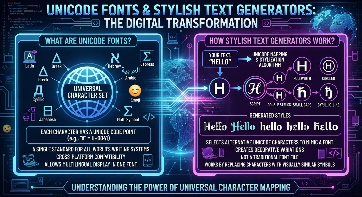
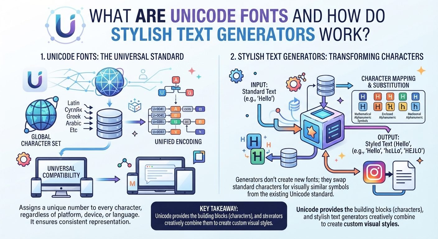
Social apps give you almost no formatting control. There is no bold button in a caption, no font menu in a bio. What people use instead is a quirk of Unicode: alongside the ordinary alphabet, the standard contains complete alternate alphabets that were encoded for mathematicians, and those letters travel through a clipboard like any other text.
That is also why the styles behave differently from each other. Some of these alphabets are complete and old and render almost everywhere; others are missing digits, missing individual letters, or assembled from two separate Unicode blocks. Choosing well means knowing which is which, and that is what the ten fancy text styles for social media below set out to make clear.
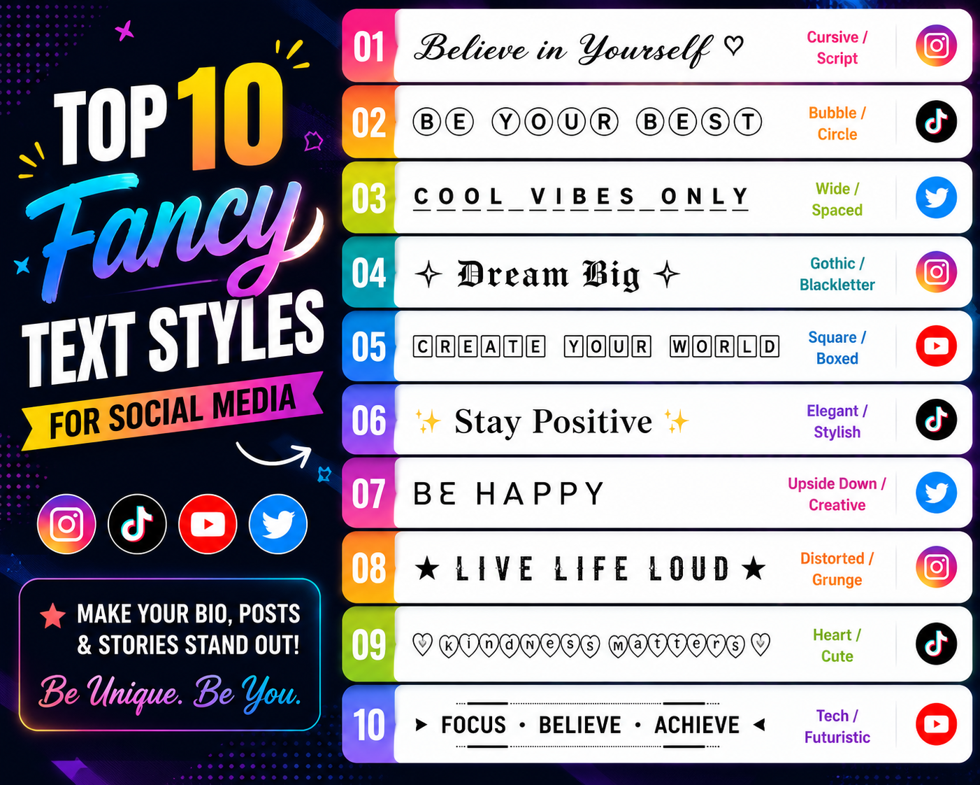
The 10 Best Fancy Text Styles for Social Media
The ten in short, ordered from the most dependable to the most decorative — jump to whichever matches what you need.
- Bold — when it simply has to be read.
- Italic — quiet emphasis, no numbers.
- Bold italic — rare enough to feel deliberate.
- Script — handwritten look for short names.
- Gothic — maximum character, minimum legibility.
- Bubble — playful, letters only.
- Small text — a quiet second line.
- Monospace — even, technical, dependable.
- Double-struck — outlined and architectural.
- Decorative — wide spacing and symbols.
1. Bold Text
The most complete style available: capitals, lowercase and digits all exist, and it renders in more places than anything else here. Because the weight is built into the characters, bold text sits slightly apart from the platform's own typeface rather than matching it — which is precisely what makes it catch the eye in a feed.
Example: 𝐖𝐞𝐥𝐜𝐨𝐦𝐞 𝐭𝐨 𝐦𝐲 𝐩𝐫𝐨𝐟𝐢𝐥𝐞 · digits included: 𝐄𝐬𝐭 𝟐𝟎𝟏𝟗
Best for: the one line you want read first — a display name, the opening words of a caption. Readability: the highest of any style here; it stays legible at length. Limitation: none worth avoiding it for.
2. Italic Text
A slanted alphabet with a quieter presence than bold. It carries one quirk worth knowing before you use it: the italic range has no digits. Numbers pass through untouched, so a line mixing words and years comes out visibly inconsistent.
Example: 𝑊𝑒𝑙𝑐𝑜𝑚𝑒 𝑡𝑜 𝑚𝑦 𝑝𝑟𝑜𝑓𝑖𝑙𝑒 · numbers stay plain: 𝐸𝑠𝑡 2019
Best for: a tagline or a single quoted line under a plain name. Readability: good in short runs, tiring across a whole paragraph. Limitation: avoid it anywhere your text contains numbers.
3. Bold Italic Text
Both treatments at once, and rarer in practice than either alone — which is most of its value. A bold italic phrase reads as deliberate rather than decorative, because far fewer profiles use it. It inherits the italic range's missing digits.
Example: 𝑾𝒆𝒍𝒄𝒐𝒎𝒆 𝒕𝒐 𝒎𝒚 𝒑𝒓𝒐𝒇𝒊𝒍𝒆
Best for: one or two emphasised words inside otherwise plain text. Readability: slightly below plain bold. Limitation: no digits, same as italic; heavy if used for a full line.
4. Script / Cursive Text
The flowing, handwritten-looking style, and the one most associated with aesthetic profiles. It exists in two weights, and they are not equally reliable. The bold script alphabet is self-contained. The lighter script is not: eight capitals and three lowercase letters were encoded separately in an older Unicode block, so some fonts draw those letters at a visibly different weight from their neighbours.
Example: 𝓦𝓮𝓵𝓬𝓸𝓶𝓮 𝓽𝓸 𝓶𝔂 𝓹𝓻𝓸𝓯𝓲𝓵𝓮 (bold script) · 𝒲ℯ𝓁𝒸ℴ𝓂ℯ 𝓉ℴ 𝓂𝓎 𝓅𝓇ℴ𝒻𝒾𝓁ℯ (light script — note the uneven letters)
Best for: display names and short signature lines. Readability: falls off quickly past a few words. Limitation: prefer the bold weight; the lighter one renders unevenly on some devices.
5. Gothic / Fraktur Text
Blackletter shapes with heavy strokes and dense texture. It has the strongest personality of any style here and the weakest legibility — several letters are genuinely hard to identify out of context, which is a real cost rather than a stylistic quibble.
Example: 𝖂𝖊𝖑𝖈𝖔𝖒𝖊 𝖙𝖔 𝖒𝖞 𝖕𝖗𝖔𝖋𝖎𝖑𝖊
Best for: a one-word display name on accounts with a darker or classical aesthetic. Readability: the lowest of the letter styles. Limitation: never use it for anything a visitor needs to read accurately.
6. Bubble Text
Letters enclosed in circles, from the Enclosed Alphanumerics block. The important limitation is coverage: it converts letters only. Digits and punctuation pass straight through, so anything with a number in it comes out half-styled. A solid, filled variant also exists and reads much heavier.
Example: Ⓦⓔⓛⓒⓞⓜⓔ ⓣⓞ ⓜⓨ ⓟⓡⓞⓕⓘⓛⓔ · mixed input breaks: ⓗⓘ 2024! · filled variant: 🅗🅔🅛🅛🅞
Best for: playful accounts and comment replies. Readability: fine for a few words, tiring beyond that. Limitation: numbers and punctuation stay unconverted. The bubble text generator shows both variants.
7. Small Text
Raised, miniature letters — superscript characters rather than a smaller font size, which means they stay small no matter what the platform does with text size. The alphabet is incomplete: there is no standard superscript q, so that letter appears at full size and gives the word away.
Example: ʷᵉˡᶜᵒᵐᵉ ᵗᵒ ᵐʸ ᵖʳᵒᶠⁱˡᵉ · the gap shows: qᵘⁱᶜᵏ
Best for: a secondary line under a name — a location, a role. Readability: deliberately low; genuinely small on a phone. Limitation: the missing letter, and unusable for anything important. See the small text generator.
8. Monospace Text
Every character occupies the same width, producing an even, typewriter-like rhythm. Unlike most styles here it includes digits, and the fixed spacing makes short strings look deliberate and technical rather than decorative.
Example: 𝚆𝚎𝚕𝚌𝚘𝚖𝚎 𝚝𝚘 𝚖𝚢 𝚙𝚛𝚘𝚏𝚒𝚕𝚎 · digits included: 𝙴𝚜𝚝 𝟸𝟶𝟷𝟿
Best for: developer, tech and minimal accounts; anything that should read as code-adjacent. Readability: high. Limitation: the uniform width makes lines physically longer, which matters where space is capped.
9. Double-Struck / Mathematical Text
Outlined letters, sometimes called blackboard bold, borrowed from mathematical notation. Like light script it is assembled from two blocks — seven capitals were encoded earlier and separately, so those letters can render at a different weight from the rest of the word depending on the device's fonts.
Example: 𝕎𝕖𝕝𝕔𝕠𝕞𝕖 𝕥𝕠 𝕞𝕪 𝕡𝕣𝕠𝕗𝕚𝕝𝕖 · the split letters: ℂℍℕℙℚℝℤ
Best for: a single word where an architectural, minimal look suits the account. Readability: moderate — the outlines thin out at small sizes. Limitation: the seven inconsistent capitals.
10. Decorative / Aesthetic Text
Less a single alphabet than an approach: fullwidth characters for airy spacing, combined with symbols as separators. Fullwidth is the widest style here — it even replaces the ordinary space with a wider ideographic one, so it consumes a character allowance faster than anything else.
Example: aesthetic · with separators: soft ✦ hours
Best for: aesthetic accounts and visual dividers between bio lines. Readability: good in isolation, poor once decoration is layered on. Limitation: the most expensive style in characters, and the most likely to cause problems for screen readers. Pair it with restraint and a few characters from the symbols library.
Which Fancy Text Style Should You Choose?
The honest summary of the fancy text styles for social media covered above. Readability here is a description, not a score — there is no measurement behind a number, so none is given.
| Style | Visual effect | Best use | Readability |
|---|---|---|---|
| Bold | Solid, high contrast | Names and opening lines | Highest — safe at any length |
| Italic | Soft, slanted | Taglines without numbers | Good in short runs |
| Bold italic | Emphatic, uncommon | One or two key words | Good, slightly below bold |
| Script | Flowing, handwritten | Display names | Drops quickly past a few words |
| Gothic | Dense, dramatic | Single-word names | Lowest of the letter styles |
| Bubble | Round, playful | Comments, casual accounts | Fine briefly, tiring at length |
| Small text | Tiny, raised | Secondary lines | Low by design |
| Monospace | Even, technical | Tech and minimal profiles | High |
| Double-struck | Outlined, architectural | A single word | Moderate |
| Decorative | Wide, airy | Aesthetic bios, dividers | Good alone, poor when layered |
If you only take one thing from the table: bold and monospace are the two styles you can use without thinking about it. Everything else is a trade of legibility for character.
Where to Use Fancy Text on Social Media
Fancy text styles for social media travel anywhere ordinary text does, but the fields themselves differ — some accept any character, some filter hard, and that varies by platform rather than by style.
- Bios and about sections — the most common home for styled text, and usually the most permissive field on a profile.
- Display names — generally accept styled characters across the major platforms, which is why they are a safer target than usernames.
- Usernames and handles — the least reliable. These are identifiers, so they are the fields most likely to be restricted to a narrow character set.
- Captions and posts — fine for a styled opening line; a fully styled caption is hard work to read.
- Comments and replies — where lighter styles like bubble text tend to look natural.
- YouTube descriptions and Discord profiles — long-form fields that render Unicode without much trouble.
One concrete example of a field-level restriction rather than a platform-wide one: Discord restricts usernames to lowercase letters, numbers and two punctuation marks — the period and the underscore — while display names accept spaces, emoji and non-Latin characters. Styling belongs in the display name there, not the username. Treat that as the pattern to expect elsewhere — check the specific field before assuming, rather than trusting that a platform "supports fancy fonts" as a whole.
For a platform-by-platform view of which field is which, the social media hub covers the naming rules per network. Gaming handles follow different rules again, and are covered separately in the guide to gaming fonts.
Read also: → How to Use Fancy Fonts on Instagram Bio — the full step-by-step walkthrough
How to Create Fancy Text
Type your words into the fancy text generator, scroll the styles until one fits, and copy it. The generator previews your own text rather than a sample phrase, so what you see is what you will paste.
The only thing to watch is that you paste rather than retype — these characters are not on your keyboard, so typing produces plain letters. If you want the field-by-field detail for one platform, the Instagram bio walkthrough linked above covers that process end to end.
Fancy Text vs Traditional Fonts
A traditional font is a file. Your device or an application loads it and draws ordinary letters using those shapes; change the font and the same letters are rendered differently. The characters underneath never change — the letter a stays the letter a whether it is set in one typeface or another.
Fancy Unicode text works the other way around. The characters themselves change, and the shape comes with them. That difference explains the behaviour people find surprising:
- It survives copy and paste between apps, because you are moving characters rather than formatting.
- It works in fields that offer no formatting controls at all.
- It cannot be searched for using the ordinary spelling, because the characters genuinely differ.
- It can fail to display, if the viewer's device has no glyph for a particular character and substitutes a box instead.
Neither approach is better in the abstract. Traditional fonts give a designer control over rendering; Unicode styling gives you emphasis in places that offer none, at the cost of everything in the list above.
Tips for Using Fancy Text Without Making Your Profile Hard to Read
- Style one element, not the whole profile. When every line is decorated, nothing stands out and the profile just becomes harder to scan.
- Keep searchable and typeable text plain. Your name, an email address, a discount code — anything a visitor may need to find or retype should stay in ordinary letters.
- Do not stack styles. Passing already-styled text through a second style usually does nothing, because the input is no longer ordinary letters.
- Watch the character cost. Wide and decorative styles use up capped fields far faster than plain text.
- Check it on a phone, and ideally a second device. Rendering depends on the fonts installed where your profile is being viewed, not where it was written.
The accessibility point deserves stating plainly rather than as a footnote. These characters are formally mathematical symbols, so assistive software does not treat them as ordinary letters — depending on the screen reader, a styled word may be announced by its technical character names or skipped over entirely. A visitor using one may get nothing usable from a fully styled profile. Keeping your name and one key line in plain text is the single change that helps most, and it costs you almost nothing visually.
Used with restraint, fancy text styles for social media do one genuinely useful job: they give you emphasis in fields that offer none at all. Pick one style, apply it to one line, and let the rest of the profile get on with saying something.
Frequently Asked Questions
What are fancy text styles for social media?
They are alternate Unicode characters shaped to look bold, italic, script, outlined or enclosed. Nothing is installed — the styling is part of the characters, which is why it survives copy and paste into a bio or caption.
Which fancy text style is the most readable?
Bold, followed by monospace. Both have complete alphabets including digits and render in more places than the decorative styles, so they stay legible at length.
Do fancy text styles work on every social platform?
No, and it varies by field rather than by platform. Bios and display names are usually permissive, while usernames are often restricted to a narrow character set. Check the specific field rather than assuming a platform supports everything.
Why do some styles leave numbers unchanged?
Because those alphabets have no digits. The italic and bold italic ranges cover letters only, so numbers pass through as ordinary characters and the line looks inconsistent.
Why does my styled text show empty boxes?
Which style you chose matters more than which app you are in. The heavily decorated ranges — gothic, outlined and enclosed letters — are the ones most often absent from a given device's fonts, and a box simply means that device cannot draw that particular character. Switching to bold or monospace, the two most completely supported styles, almost always clears it.
Can people still search for my profile if I use fancy text?
Not by the styled words. Those are different characters from the ones people type, so anything you want to be found by should stay in plain letters.
Are fancy text styles bad for accessibility?
Heavy use is. Screen readers treat these as mathematical symbols rather than letters, so styled text may be read out as character names or skipped. Keeping key information in plain text avoids the problem.
Can I combine two fancy text styles in one word?
Generally no. Once text has been converted, the characters are no longer ordinary letters, so a second style has nothing to convert and leaves them unchanged.