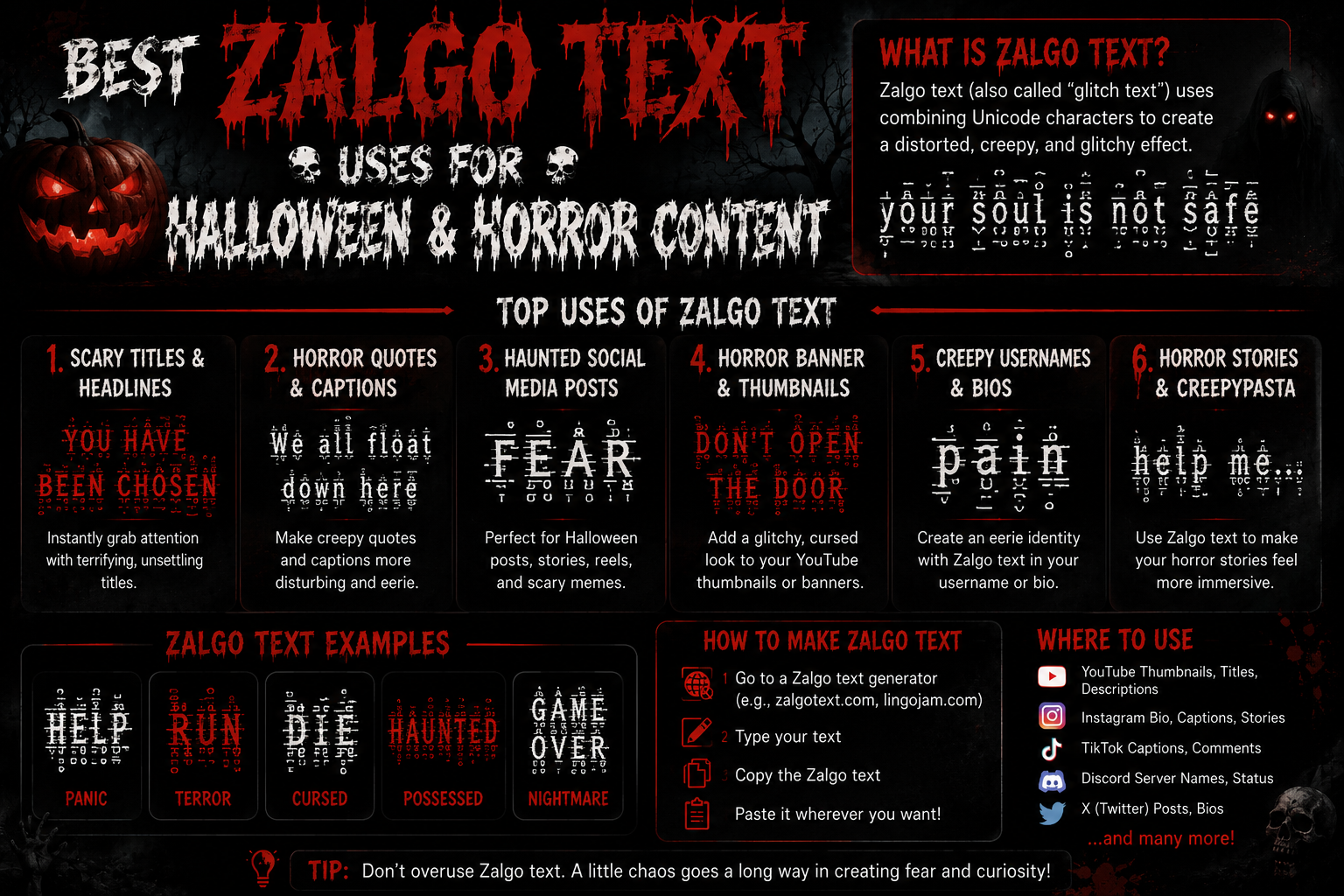
Zalgo text is ordinary text with combining marks stacked on top of it, so the letters appear to bleed and distort. Nearly all worthwhile Zalgo text uses come back to that single property: it reads as damaged rather than decorative, which is a difficult effect to get from a font, and it is why the style keeps resurfacing every October.
The mistake most people make is treating distortion as a volume knob to turn all the way up. Past a certain point the words stop being words, and a caption nobody can read is worth less than a plain one. The useful range is narrower than it looks, and most of this guide is about staying inside it.
What Makes Zalgo Text Good for Horror Content?
Horror works on wrongness — something familiar that is not behaving correctly. Zalgo does exactly that to text. The letters are still recognisable, so your brain reads them, but they are visibly damaged, so it also flags that something is off. That tension is the whole effect.
It also carries a specific cultural memory. Distorted text has meant "corrupted file", "possessed transmission" or "something got into the system" since long before it had a name, which is why it reads as horror instantly without any explanation. A skull emoji says Halloween; distorted text says something is wrong with this message.
The practical advantage over an image is that it is still text. It survives a copy and paste, it works in a field that accepts nothing but characters, and it costs nothing to produce. A horror-themed username, a caption, a Discord status — all places an image cannot go.
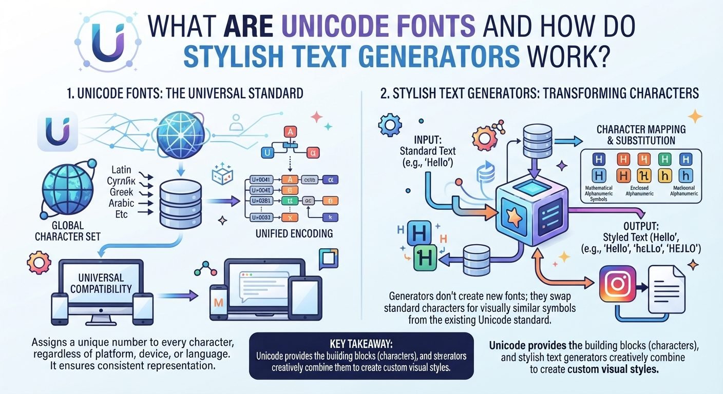
Mechanically it is simple, and knowing the shape of it makes the rest of this guide easier to follow: combining marks are characters that attach to the letter before them rather than occupying their own space — Unicode lists them in its Combining Diacritical Marks chart, where they exist for accents rather than for horror. Stack several onto one letter and they pile upward and downward from it. That is the entire trick — there is no font involved, and the underlying letters never change, which is why the text still copies, pastes and searches as whatever you originally typed.
The limitation is equally practical, and it is worth stating before the use cases rather than after: the effect depends entirely on the reader still being able to read it. Distortion is a seasoning, not the meal.
Best Zalgo Text Uses for Halloween
These are the Zalgo text uses that genuinely earn their keep, roughly in order of how well they work.
Halloween Social Media Captions
The strongest use, because a caption is short and the reader is already looking at an image for context. Distort two or three words, not the whole sentence — the contrast between clean and corrupted is what sells it.
Select any name in the following list to copy it.
A caption that reads "the party starts at 8 · b̂r̃ĩńg̃ ă l̈îǵh̃t̀" does more than one where every word is mangled, because the eye has somewhere clean to land first.
Creepy Instagram Posts
Instagram renders combining marks, but its line spacing is tight, and marks stacked above a letter can clip against the line above in a bio or a comment. One mark above per character is the safe ceiling there; two is usually still fine in a caption, where lines have more room.
Keep the account name itself plain. A distorted display name that nobody can search for costs you more than the aesthetic gains — the Instagram bio guide covers which field tolerates what.
Halloween Stories and Status Updates
Stories are the most forgiving surface on this list. Text sits on top of an image with generous spacing, nothing needs to be searchable, and the whole thing disappears in a day — so a heavier level works here than anywhere else.
Select any name in the following list to copy it.
Discord Halloween Messages
Discord handles combining marks well and its message spacing is roomy, which makes it the best chat platform for this. Server names, channel topics, and a seasonal display name all work.
One caution specific to Discord: the username field is restricted to plain characters, so distortion belongs in your display name or server nickname instead. The Discord naming page covers which of those fields accepts what.
Gaming and Horror Game Names
This is where the effect is oldest and most at home. A distorted tag in a horror game reads as intentional in a way it would not on a professional profile.
Most games are far stricter than social platforms, though. Many reject combining marks outright, and some accept them at signup then render them as boxes in the killfeed. Test before committing, especially where a name change costs currency — our guide to gaming fonts covers which styles survive which games.
Select any name in the following list to copy it.
Halloween Invitations
A digital invitation is one of the few places heavy distortion is safe, because the important details can sit in plain text beside it. Distort the title, keep the date, address and time completely clean. Nobody should have to decode when your party starts.
Horror-Themed Profiles and Bios
A bio gives you more room than a name field, which means you can afford one distorted line as a hook and leave the rest readable. That structure — one corrupted line, everything else plain — is the most reliable pattern in this whole guide.
Pairing it with a symbol rather than more distortion usually looks better. A single character from the skull symbols or warning symbols sets do more work than a third combining mark.
Creepy Chat Messages
Effective in short bursts between friends who will find it funny, and irritating in anything longer. A one-line "ḭ́t̰̊ ḵ̇ṇ̂ö̱ẘ̮ŝ̱ ŷ̧ó̥ù̱ṛ̇ ņ̈à̧m̮̊ȩ̇" lands; a paragraph of it just looks like a rendering bug and people will assume your keyboard is broken.
One pattern is worth naming because it recurs in almost every use case below: corrupt one element, leave the rest clean. A distorted first line above a plain paragraph, a damaged title above readable details, one glitched word inside an ordinary sentence. The clean text gives the reader somewhere to stand, and the contrast is what makes the distorted part read as deliberate rather than accidental. Uniform distortion loses that reference point, which is why it so often looks like a font failed to load rather than like a choice.
Zalgo Text Examples for Different Horror Styles
Different horror moods want different intensities. These are grouped by the feeling rather than by the setting, since the setting is yours to supply.
Subtle creepy
One mark per character. Reads as slightly wrong rather than obviously corrupted, and survives almost anywhere.
Select any name in the following list to copy it.
Dark and atmospheric
One above, one below. The marks below give it weight without reducing legibility much.
Select any name in the following list to copy it.
Haunted
Two above, one below — the point where text starts to look actively damaged.
Select any name in the following list to copy it.
Corrupted and glitched
Same intensity, but the phrasing does the work. Machine language distorts differently in the reader's head than atmosphere does.
Select any name in the following list to copy it.
Unsettling and direct
Short second-person phrases, kept light on purpose. These rely on what they say, so legibility matters more than the effect.
Select any name in the following list to copy it.
Extreme
Four marks per character. Included so you can see the ceiling, not because you should use it — this is already past the point where most platforms lay it out cleanly.
Select any name in the following list to copy it.
Subtle vs Extreme Zalgo Text
The single decision that determines whether this looks good is how many marks sit on each character. Everything else is secondary.
| Level | Marks per character | Reads as | Use it for |
|---|---|---|---|
| Subtle | 1 | Slightly wrong | Captions, bios, anything that must stay readable |
| Moderate | 2 | Clearly distorted | Stories, Discord, short posts |
| Heavy | 3 | Actively damaged | Titles, one-word hooks, story text |
| Extreme | 4+ | Barely text | Demonstrations, and little else |
Across almost all Zalgo text uses, subtle is underrated and heavy is overrated. At one mark per character the reader registers the wrongness without consciously noticing why, which is a better horror effect than text so mangled it just reads as broken. Heavy distortion announces itself; subtle distortion unsettles.
There is also a practical reason to stay low. Marks stack upward and downward from the baseline, so heavy text needs vertical room. In a tight line-height — a comment thread, a bio, a chat list — the marks collide with neighbouring lines and the result looks like a layout bug rather than a design choice.
How to Use Zalgo Text Without Making It Unreadable
Six habits cover almost every problem people run into.
- Distort part of the message, never all of it. One corrupted phrase against clean text reads as deliberate. Everything corrupted reads as an error.
- Keep anything actionable plain. Dates, times, prices, links, handles, instructions. If a reader needs to act on it, it stays readable.
- Match the intensity to the line height. Roomy surfaces like Stories take more; tight ones like comments and bios take less.
- Check it on a phone. Mark stacking behaves differently at small sizes, and most people will see your post on a phone rather than where you made it.
- Paste, do not retype. These marks are not on a keyboard, so retyping produces plain text.
- Test in the actual field. Accepting a paste and storing it are different things; some fields strip combining marks on save.
The accessibility point deserves its own paragraph rather than a bullet. Screen readers do not skip combining marks — depending on the software they may announce each one, which turns a short distorted phrase into a long stream of character names. A reader using one may get something genuinely unpleasant rather than merely undecipherable. Keep at least one plain-text version of anything that carries real information, and never distort the only copy of something a person needs.
Zalgo Text Ideas for Horror Creators
If you are making horror content rather than just posting around Halloween, the Zalgo text uses get more specific.
- Video titles and thumbnails. One distorted word in a title stands out in a feed. A fully distorted title is often truncated badly and can be hard to search for.
- Fictional character voices. Giving one character distorted dialogue is an efficient way to mark them as not-quite-human without describing it.
- Corrupted-document effects. Distorting only the parts of a fictional log that are meant to be damaged is more convincing than distorting the whole thing.
- ARG-style puzzles. Distortion suits hidden or degraded messages, though anything a player must actually read to progress should stay legible.
- Seasonal campaign art. A single distorted line across otherwise clean branding reads as a deliberate seasonal choice.
One constraint worth planning around: distorted text does not survive being turned into an image and back. If your workflow involves screenshotting a caption, or a platform renders titles into thumbnails server-side, the marks may be positioned differently there than in your editor. Check the output, not the input, when the final surface is an image rather than live text.
Two things to avoid regardless of the project. Do not use distortion to imitate another person or brand — the visual similarity is the point of the trick and the reason platforms treat it as impersonation. And do not use it to slip wording past a moderation filter; that is what gets combining marks stripped platform-wide, and it affects everyone using them legitimately.
Read also: → How to Type Upside Down Text — the other way to make text look wrong
When NOT to Use Zalgo Text
Some Zalgo text uses are simply worse than plain text, and reaching for distortion anyway is the fastest way to make a post look amateurish.
- Anything instructional. Steps, directions, requirements. If someone has to follow it, they have to read it.
- Support and customer messages. Distorted text in a help context reads as broken software, not as personality.
- Long paragraphs. The effect stops working after a line or two and becomes work for the reader.
- Professional profiles. The association is horror and internet in-joke; neither helps on a work account.
- Accessibility-sensitive contexts. Anywhere you know or expect screen readers, keep it plain.
- Usernames on strict platforms. Many identifier fields reject combining marks outright, and some strip them silently after you save.
How to Create Zalgo Text
On this site, the distorted style is called Aggressive and lives in the Gaming category of the stylish font generator — expand the category to see it, type your text, and copy the result. It applies two combining marks per character, which puts it at the moderate level described above — enough for most Zalgo text uses without tipping into the unreadable end.
That is a fixed intensity rather than an adjustable one, so if you want the subtle or heavy variants shown in this guide you will need a tool with an intensity control. The examples on this page are copy-ready in the meantime.
Distortion is one of several ways to make text look wrong, and the others are worth knowing: upside down text flips characters rather than damaging them, invisible characters remove them from view entirely, and the styles comparison covers the ten that stay readable.
Frequently Asked Questions
What is Zalgo text used for?
Mostly horror and Halloween content — captions, usernames, Discord messages, video titles and fictional character voices. It reads as corrupted rather than decorative, which is a look that is hard to get any other way in a plain text field.
How can I use Zalgo text for Halloween?
Distort one or two words of a caption rather than the whole thing, keep event details like dates and addresses plain, and lean on Stories and Discord where line spacing is generous. The contrast between clean and corrupted text is what creates the effect.
How much distortion should I use?
One combining mark per character for anything that must stay readable, two for short posts and Stories, three only for titles or single words. Four or more is past the point where most platforms lay it out cleanly.
Why does extreme Zalgo text become unreadable?
Each combining mark stacks further above or below the letter, so at high counts the marks obscure the letters themselves and collide with neighbouring lines. The text is intact underneath; there is simply too much drawn on top of it to read.
Can I use Zalgo text on social media?
Generally yes in captions, bios and Stories, which accept arbitrary characters. Username and handle fields are far stricter and often reject combining marks, so check the specific field rather than assuming the platform allows it everywhere.
Can I use Zalgo text in gaming profiles?
Sometimes, and less often than on social platforms. Many games reject combining marks at signup, and some accept them then display boxes in-game. Always paste-test before spending a name change on it.
Is Zalgo text accessible?
Not really, and this is its main drawback. Screen readers may announce every combining mark individually, turning a short phrase into a long stream of character names. Keep a plain version of anything that carries real information.
Why did my distorted text lose its marks when I saved it?
The field stripped them. Some platforms remove combining marks on save, particularly in name and identifier fields, because they are commonly used to evade moderation. Nothing is wrong with what you pasted; that field simply will not keep it.
How do I create Zalgo text on this site?
Use the Aggressive style in the Gaming category of the stylish font generator. It applies two combining marks per character, which is the moderate level described in this guide.