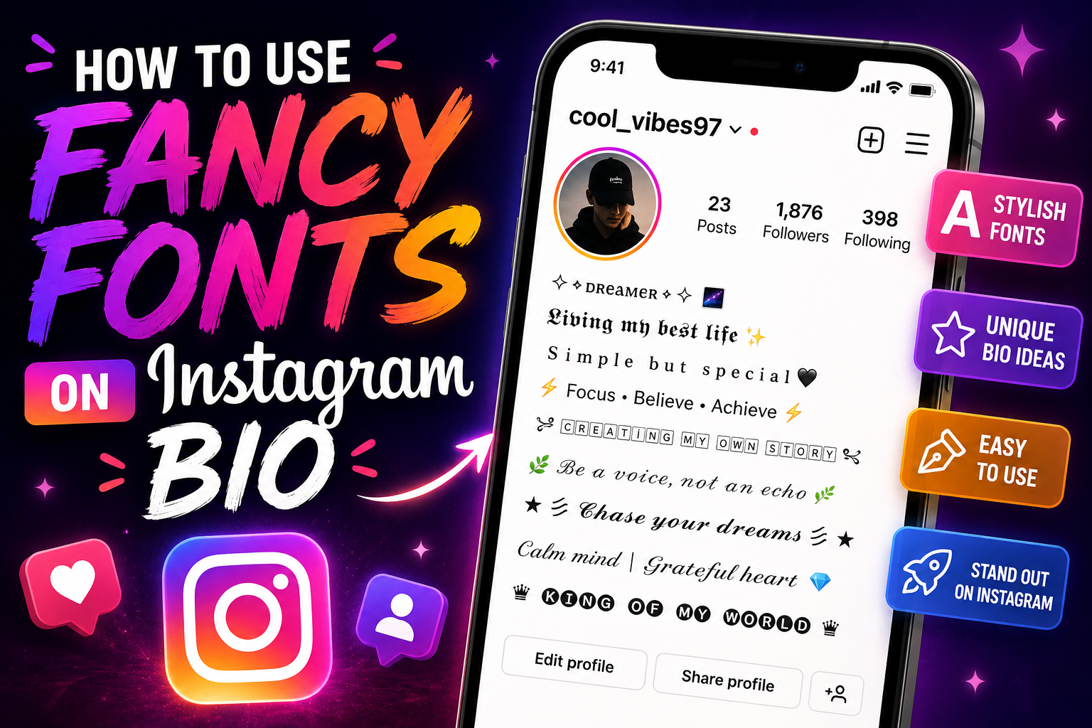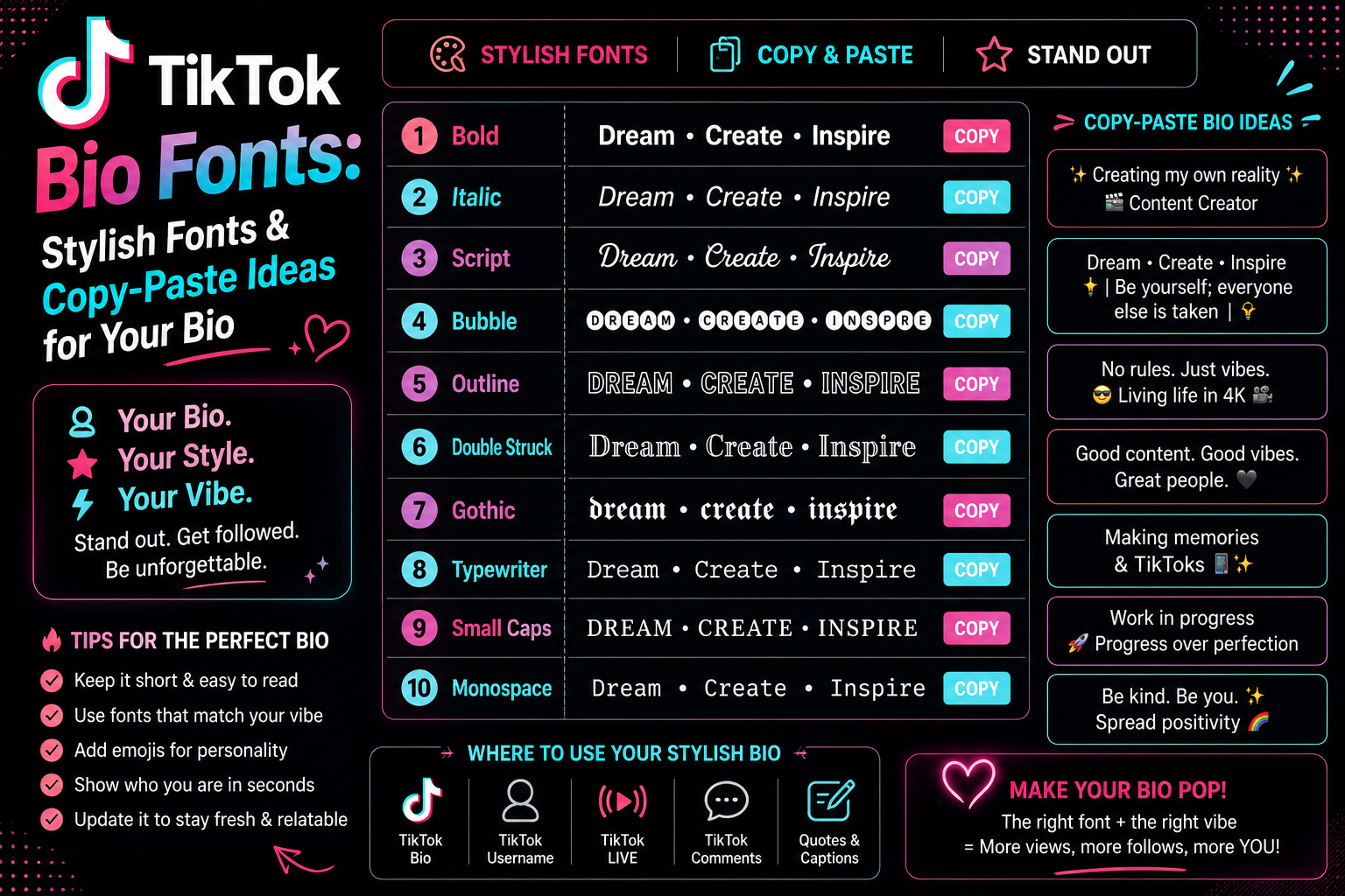
TikTok bio fonts are Unicode characters that already look bold, italic or cursive, pasted into an ordinary bio field. TikTok has no font setting, so nothing is installed — which is why the styling survives a copy and paste, and why the occasional letter arrives as an empty box.
They are not fonts in the usual sense. TikTok has no font setting, so the styled text you see on other profiles is made of Unicode characters that already look bold, italic or cursive — pasted into an ordinary bio field. That is why it survives copy and paste, and why it behaves differently from the bold button in a word processor.
A styled bio does one job well: it makes the first line of your profile stop the eye for a moment longer. It is worth knowing what it costs, though. Styled characters are not searchable as ordinary words, they are read differently by assistive software, and a bio built entirely from them is harder to scan than a plain one. The aim is a profile that looks considered, not one that has to be decoded.
It also helps to know where a bio is actually read. On TikTok most people meet you through a video on the FYP first, then tap the handle to reach your profile — so the bio is scanned in a couple of seconds, on a phone, by someone deciding whether to follow. It sits under your display name and above your links, competing with both for that glance. That is a harsher reading environment than a desktop profile page, and it is why the styles that survive here are the legible ones rather than the elaborate ones.
What Are TikTok Bio Fonts?
The characters come from alternate alphabets built into Unicode itself — the Mathematical Alphanumeric Symbols block, encoded for mathematical notation rather than for social profiles, then borrowed for this. Each styled letter is a real character with its own codepoint, which is why it can live in a database field, travel through a clipboard, and arrive intact on someone else's phone.
One boundary is worth setting before you start: this applies to the bio, not to your @username. That handle is an identifier TikTok uses for search and mentions, and it accepts a narrow character set — styled characters belong in the bio and the display name, which are far more permissive. So a "TikTok font" is really a character swap. Your a is replaced by a different character that happens to be drawn bold or cursive. Nothing is installed, nothing is applied on top, and changing the app or the device does not change the shape, because the shape belongs to the character rather than to a style rule.
That distinction explains the behaviour people find surprising: the text works in a field with no formatting controls, it survives being copied between apps, it cannot be found by searching the ordinary spelling, and it occasionally renders as an empty box on a device whose fonts do not include that character. The full styles comparison goes through how each alphabet is built; this guide sticks to how they behave in a TikTok bio specifically.
Best TikTok Bio Font Styles
Ten TikTok bio fonts worth knowing, judged only on how they hold up in the field itself — which is short, read on a phone, and usually scanned rather than read.
Bold TikTok Bio Fonts
The safest choice and the one that survives the most devices. Bold has a complete alphabet including digits, so a line with a year or a number in it stays consistent. 𝗣𝗼𝘀𝘁𝗶𝗻𝗴 𝗲𝘃𝗲𝗿𝘆 𝗧𝗵𝘂𝗿𝘀𝗱𝗮𝘆
Italic TikTok Bio Fonts
Softer emphasis, and the one quirk to plan around: the italic range has no digits, so numbers drop back to plain. Fine for words, awkward for anything with a date in it. 𝘕𝘰𝘵𝘦𝘴 𝘧𝘳𝘰𝘮 𝘢 𝘴𝘭𝘰𝘸 𝘸𝘦𝘦𝘬
Bold Italic Fonts
Uncommon enough on TikTok that it registers as a choice, which is the whole reason to reach for it over plain bold. Numbers drop out here too, so save it for a line of pure wording. 𝙍𝙚𝙖𝙙 𝙩𝙝𝙚 𝙘𝙖𝙥𝙩𝙞𝙤𝙣 𝙛𝙞𝙧𝙨𝙩
Small Text Styles
Raised miniature letters, useful as a second line under a bolder one. The alphabet is incomplete — there is no superscript q — so that letter stays full size and gives the trick away. ᵃ qᵘⁱᵉᵗ ˢᵉᶜᵒⁿᵈ ˡⁱⁿᵉ
Monospace Fonts
Even character widths and a technical feel, digits included. It runs physically wider than other styles, which matters in a capped field. 𝚋𝚞𝚒𝚕𝚍 𝚒𝚗 𝚙𝚞𝚋𝚕𝚒𝚌
Cursive & Script Styles
The most decorative of the readable options and the most common on aesthetic profiles. It falls apart across a long line, so keep it to a few words. 𝓼𝓸𝓯𝓽 𝓵𝓪𝓾𝓷𝓬𝓱 𝓼𝔃𝓷
Aesthetic TikTok Bio Fonts
Less a single alphabet than an approach: wide spacing, a light style, and a symbol used as a separator rather than decoration. Fullwidth text replaces even the spaces with wider ones, so it eats a capped bio fastest. slow living
Minimal Fonts
Small caps sits between plain and styled — tidy, quietly different, and legible at a glance. If you want the bio to look considered rather than decorated, this is usually the answer. ᴀʀᴄʜɪᴠᴇ ᴏꜰ ꜱᴍᴀʟʟ ᴛʜɪɴɢꜱ
Cute Fonts
Circled letters read as playful and friendly. They convert letters only, so digits and punctuation pass through unchanged and a mixed line comes out half-styled. ⓢⓝⓐⓒⓚ ⓡⓔⓥⓘⓔⓦⓢ
Gothic & Dark Fonts
Blackletter shapes with the strongest personality and the weakest legibility on this list. One or two words at most, and never on a line carrying real information. 𝖓𝖎𝖌𝖍𝖙 𝖘𝖍𝖎𝖋𝖙
TikTok Bio Font Examples You Can Copy
50 ready-made lines, grouped by the kind of account they suit. Each is written once in a single style rather than the same phrase repeated through every alphabet — the point is to show what different styles do to different kinds of wording. Tap to copy, then swap the words for your own.
Gaming bios
Select any name in the following list to copy it.
Creator bios
Select any name in the following list to copy it.
Personal bios
Select any name in the following list to copy it.
Aesthetic bios
Select any name in the following list to copy it.
Funny bios
Select any name in the following list to copy it.
Motivational bios
Select any name in the following list to copy it.
Music bios
Select any name in the following list to copy it.
Fashion bios
Select any name in the following list to copy it.
Fitness bios
Select any name in the following list to copy it.
Business bios
Select any name in the following list to copy it.
Read also: → Small Text Generator — for the quiet second line under a bolder one
How to Add Stylish Fonts to Your TikTok Bio
The process is short. The only step people skip is the last one.
- Pick a style, or type your wording into the font generator to see it in every style at once.
- Copy the version you want — tap the copy button rather than selecting by hand, since a dragged selection often misses the first or last character.
- Open TikTok and go to your profile.
- Open the profile editing screen and tap the bio field.
- Paste the styled text, and type any plain wording you want to keep unstyled.
- Save, then reload your own profile and look at it. Some fields accept a paste and strip the characters when storing it, and reloading is the only way to catch that.
TikTok renames things between releases, so match the sequence rather than hunting for those exact words on screen. And it has to be a paste: the keyboard has no way to produce these characters, so typing them out by hand just gives you plain letters again.
One thing worth watching rather than assuming: TikTok caps how long a bio can be, and that cap has changed over time. Styled characters count toward it like any others, and the wider styles consume it faster, so keep an eye on the counter in the app rather than trusting a number you read somewhere.
Best Fonts for Different TikTok Profiles
Which of these TikTok bio fonts suits you depends less on taste than on what your bio has to do.
| Profile type | Recommended style | Example | Why it works |
|---|---|---|---|
| Gamer | Bold or small caps | 𝗿𝗮𝗻𝗸𝗲𝗱 𝗴𝗿𝗶𝗻𝗱 | Reads fast, complete alphabet, no legibility cost |
| Creator | Bold first line, plain rest | 𝗻𝗲𝘄 𝘃𝗶𝗱𝗲𝗼 𝗧𝗵𝘂𝗿𝘀𝗱𝗮𝘆 | Emphasis where the schedule is, detail stays scannable |
| Aesthetic | Script or wide spacing | 𝓺𝓾𝓲𝓮𝓽 𝓶𝓸𝓻𝓷𝓲𝓷𝓰𝓼 | Matches a soft visual feed without extra symbols |
| Business | Small caps or plain | ʙᴏᴏᴋɪɴɢꜱ ᴏᴘᴇɴ | Looks considered while keeping contact details readable |
| Funny | Circled or monospace | ⓤⓝⓢⓔⓡⓘⓞⓤⓢ | Playful shapes suit the tone without trying too hard |
| Music | Bold italic | 𝙨𝙤𝙪𝙣𝙙 𝙤𝙣 | Carries energy in two words, which is all a music bio needs |
| Fashion | Script or italic | 𝘵𝘩𝘳𝘪𝘧𝘵𝘦𝘥 𝘧𝘪𝘵𝘴 | Reads editorial rather than technical |
| Personal | Plain with one styled line | ᴍᴏꜱᴛʟʏ ʜᴇʀᴇ ᴛᴏ ʟᴜʀᴋ | The contrast does the work; nothing is hard to read |
How to Make Your TikTok Bio Look Better With Fonts
Six habits separate a bio that looks designed from one that looks decorated, and they matter more than which of the TikTok bio fonts you picked.
- Style one line, not all of them. Contrast is the entire effect. When every line is styled there is nothing left to stand out against.
- Use one style, or at most two. Three different alphabets in a four-line bio reads as indecision rather than personality.
- Keep the useful words plain. A booking email, a discount code, a schedule — anything a visitor may need to read accurately or type stays in ordinary letters.
- Use line breaks sparingly. A bio broken into five short lines looks longer but scans worse than two considered ones.
- Let symbols punctuate, not fill. One character from the symbols library between ideas does more than a decorative border. The same is true of emoji — one is a signal, four is noise.
- Match the style to the account. A gothic bio over a cooking feed reads as a mismatch, however good the style looks on its own.
If your lines are collapsing together, the fix is usually spacing rather than styling. Blank characters hold a line apart where an ordinary space gets trimmed — invisible characters covers how that works and where it fails.
TikTok Bio Fonts vs Normal Text
TikTok bio fonts buy attention and cost a few things that are easy to overlook until they matter.
| Styled Unicode text | Normal text | |
|---|---|---|
| Visual distinction | High — stands out in a feed | None |
| Readability | Varies by style; some are demanding | Consistent |
| Searchability | Not matched by ordinary spelling | Fully searchable |
| Rendering | Depends on the viewer's installed fonts | Reliable everywhere |
| Copy and paste | Survives intact | Survives intact |
| Screen readers | Often announced oddly or skipped | Read normally |
The practical reading of that table: styling is worth it on a line whose job is to be noticed, and not worth it on a line whose job is to be read, found or acted on. Most good bios contain both kinds of line, which is why mixing beats committing to either extreme.
TikTok Bio Font Problems to Watch For
Five things go wrong with TikTok bio fonts often enough to plan around.
- Empty boxes. A phone without that character installed shows a rectangle instead. Nothing about your bio is broken — but you will not see it happen on your own device, which is why this one goes unnoticed for weeks.
- Half-converted lines. Several alphabets are incomplete — italic has no digits, small text has no q, circled letters skip punctuation — so part of your line stays plain and the effect looks accidental.
- Characters stripped on save. Some fields accept a paste and remove unusual characters when storing. If your bio reverts after saving, that is what happened.
- Looks different on another phone. Rendering depends on installed fonts, so the same bio can look crisp on yours and cramped on someone else's. Checking on a second device is the only real test.
- Too much decoration. The most common failure is not technical. A bio crowded with styled text, symbols and emoji gives a visitor nowhere to look first.
Accessibility and Readability
Every other trade-off in this guide costs you something. This one costs your visitors, which is why it gets its own section instead of a bullet point.
Styled Unicode is not the same thing as semantic bold or italic. A word processor's bold marks text as emphasised while leaving the letters intact; these characters replace the letters entirely. Assistive software therefore does not read them as ordinary words — depending on the screen reader, a styled line may be announced by its technical character names or skipped, so a visitor relying on one can get nothing usable from a fully styled bio.
That is not a reason to avoid styling. It is a reason to keep at least one plain line carrying the information that matters — who you are, what you post, how to reach you — so the bio still works for everyone. Decoration on top of readable text is fine; decoration instead of it is not.
TikTok Bio Font Ideas by Vibe
Short starting points if you know the mood but not the wording. Each pairs one of the TikTok bio fonts above with a line that suits it.
- Cute — circled or script, one line, one symbol: ⓢⓝⓐⓒⓚ ⓕⓘⓡⓢⓣ
- Aesthetic — script or wide, nothing else competing: soft focus
- Cool — small caps, no symbols at all: ʟᴇꜱꜱ ɪꜱ ᴛʜᴇ ᴘᴏɪɴᴛ
- Dark — gothic on one or two words only: 𝖆𝖋𝖙𝖊𝖗 𝖍𝖔𝖚𝖗𝖘
- Gaming — bold, digits intact: 𝗿𝗮𝗻𝗸𝗲𝗱 𝘀𝗶𝗻𝗰𝗲 𝟮𝟬𝟭𝟵
- Professional — plain, or small caps at most: ᴏᴘᴇɴ ꜰᴏʀ ᴡᴏʀᴋ
- Minimalist — monospace, lowercase, short: 𝚘𝚗𝚎 𝚝𝚑𝚒𝚗𝚐 𝚊𝚝 𝚊 𝚝𝚒𝚖𝚎
- Funny — mixed styles used deliberately: 𝙪𝙣𝙨𝙚𝙧𝙞𝙤𝙪𝙨 𝙖𝙘𝙘𝙤𝙪𝙣𝙩
If TikTok is not the only place you post, keeping the same style across profiles compounds recognition — the social media hub covers which field accepts what on each network, and the Instagram bio guide works through that platform in the same detail this one gives TikTok. For the name above the bio rather than the bio itself, see stylish TikTok names.
Read also: → TikTok Emoji List: All 46 Secret Emoji Codes & Meanings (2026)
Frequently Asked Questions
How do I get different fonts for my TikTok bio?
Type your wording into a font generator, copy the version you like, then paste it into the bio field on your profile editing screen. Retyping will not work, because these characters are not on a normal keyboard.
Which font is best for a TikTok bio?
Bold for most accounts and small caps if you want something quieter. Both have wide device support and stay legible at a glance, which matters more in a short field read on a phone than any decorative style does.
Why do some TikTok fonts show as boxes?
Because that phone has no drawing for the character and falls back to an empty rectangle. It is a gap on the viewer's device rather than a fault in your bio, and it happens most with the decorative alphabets. Bold and small caps are the least likely to trigger it.
Why did part of my bio stay unstyled?
Because that alphabet is incomplete. The italic ranges have no digits, small text has no letter q, and circled letters skip most punctuation, so anything without an equivalent is left as ordinary text.
Can I use bold text in a TikTok bio?
You can paste bold-looking Unicode characters, which is different from applying bold formatting. There is no formatting button in the bio field, so the boldness has to come from the characters themselves.
How many font styles should I use in a bio?
One, or two at most. A bio is only a few lines, and each additional style removes the contrast that made the first one effective.
Are fancy TikTok fonts bad for accessibility?
A fully styled bio can be, yes. Because the characters are formally mathematical symbols, assistive software may not present them as words at all — so a visitor using it learns nothing about your account. One plain line describing who you are solves it without giving up the styling elsewhere.
Will a styled bio affect whether people find me?
It can. TikTok matches what someone types against the characters actually stored in your profile, and a styled word is stored as a different set of characters. If your niche or your name is the thing you want surfacing in search, that part of the bio is better left alone.
Can I use symbols with TikTok bio fonts?
Yes, and sparingly works best. One symbol as a separator between ideas reads as deliberate; several used as decoration make a short bio harder to scan.