Stylish text can make a username, profile name, caption, bio, or message look more creative. Decorative Unicode characters, symbols, special spacing, and unusual letter styles can give ordinary text a completely different appearance.
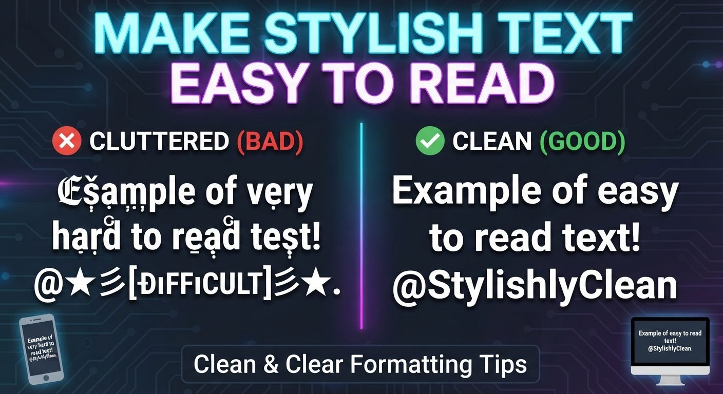
The problem is that attractive text is not always easy to read.
A style that looks excellent on a large computer screen may become difficult to recognize on a phone. Thin characters can disappear at small sizes, unusual symbols can blend into letters, and decorative fonts can become confusing when displayed in a notification or comment.
If you want stylish text that works well across phones and computers, the goal should be to find a balance between visual personality and readability.
Read also: → How to Use Fancy Fonts on Instagram Bio
Start With Readable Words
The easiest way to make stylish text readable is to begin with a clear name or phrase.
For example:
Moon Light
is easy to understand before any decoration is added.
You can then experiment with different styles:
𝑴𝒐𝒐𝒏 𝑳𝒊𝒈𝒉𝒕
or:
Moon Light ✦
or:
『Moon Light』
The original words remain recognizable in each version.
Starting with a complicated phrase and adding decorative characters everywhere can make the final result much harder to read.
Choose a Simple Font Style
Stylish text does not need to be extremely decorative.
Some styles change the appearance of the letters while keeping their basic shapes easy to recognize.
For example:
Nova
can become:
𝐍𝐨𝐯𝐚
without adding extra symbols or unusual spacing.
A simple bold style can provide visual emphasis while preserving the basic structure of the letters.
This is often more practical than choosing a style where every character has a highly unusual shape.
Avoid Extremely Thin Characters
Thin decorative characters can look elegant on a large screen.
However, they may become difficult to see when the text is reduced.
For example:
𝑆𝑜𝑓𝑡 𝑀𝑜𝑜𝑛
may appear attractive when enlarged but become less clear in a small profile area.
A slightly heavier style can provide better visibility.
The best choice depends on the particular characters, but the general principle is simple: do not sacrifice clarity just to make the text look delicate.
Avoid Extremely Heavy Decoration
The opposite problem can also occur.
Very bold characters combined with multiple symbols may create a crowded appearance.
For example:
★『𝐍𝐎𝐕𝐀』★
may be visually noticeable, but adding even more symbols can quickly make the name harder to recognize.
Try removing elements one at a time.
If the name becomes easier to read without losing its personality, the extra decoration was unnecessary.
Use Symbols Sparingly
Symbols can help separate words or create a particular mood.
Useful examples include:
- ★
- ✦
- ✧
- ♡
- •
- ~
- 『 』
- 「 」
A simple name such as:
Nova ✦
may be easier to read than:
★✦『Nova』✦★
There is no fixed number of symbols that is correct. The important question is whether the symbols support the text or compete with it.
Keep the Main Word Easy to Recognize
When someone sees your stylish text, they should be able to identify the main word quickly.
Suppose your username is:
Shadow
The most important thing is that people recognize "Shadow."
A decorative style should enhance that word rather than make it difficult to decode.
This is particularly important if the name is used as part of your online identity.
If people remember only the symbols but not the actual name, the decoration has become too dominant.
Use Capitalization to Separate Words
Capitalization can improve readability when a username contains multiple words.
Compare:
moonlightdreamer
with:
MoonLightDreamer
The second version can be easier to scan because the beginning of each word is more visible.
A stylish version can preserve this structure:
𝑴𝒐𝒐𝒏 𝑳𝒊𝒈𝒉𝒕 𝑫𝒓𝒆𝒂𝒎𝒆𝒓
If the platform does not allow spaces, clear capitalization can still help separate the words.
For example:
MoonLightDreamer
is generally easier to understand quickly than a long sequence of lowercase characters.
Use Spaces Carefully
Spaces can improve readability by creating visual separation between words.
For example:
Silver Moon
is immediately understandable.
However, unusual Unicode spacing characters can behave differently across platforms.
If ordinary spaces are supported, they are generally easier to rely on.
For usernames that do not allow spaces, consider using capitalization, underscores, or another simple separator where permitted.
Avoid Unusual Spacing Tricks
Some stylish text generators add invisible or special spacing characters.
These can sometimes produce interesting layouts, but they may create problems.
The text might:
- Look different on another device
- Behave differently when copied
- Break when pasted into a username field
- Be difficult to search
- Cause unexpected line wrapping
If readability is the priority, ordinary spaces are usually a safer choice.
Be Careful With Similar-Looking Characters
Some Unicode characters look very similar to ordinary letters or numbers.
This can create confusion.
For example, a decorative style may make:
- O look like 0
- I look like l
- S look like 5
- B look like 8
When someone sees your name quickly, they may not know which character they are looking at.
This becomes especially problematic if the name needs to be typed or searched.
Choose a style where the letters remain visually distinct.
Keep Long Text Simpler
Stylish text is easier to read when it is short.
A single word can tolerate more decoration than a full sentence.
For example:
𝑵𝒐𝒗𝒂
is relatively easy to scan.
A long paragraph written entirely in decorative Unicode characters can become exhausting to read.
For longer content, use normal text for the main information and reserve stylish formatting for headings, short names, or small decorative elements.
Test Different Browsers
Browsers can sometimes render Unicode characters differently depending on the operating system and available fonts.
Common browsers include:
- Chrome
- Edge
- Firefox
- Safari
You do not necessarily need to test every possible browser, but if your stylish text is important to a website or public profile, checking more than one environment can help.
Understand Unicode Compatibility
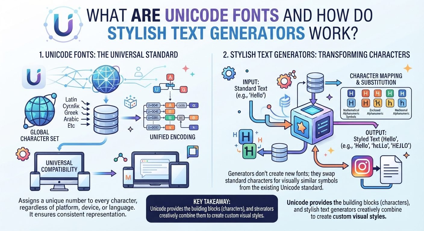
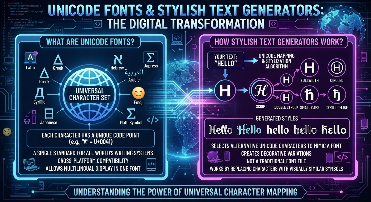
Many stylish text generators work by converting ordinary letters into Unicode characters.
For example:
Nova
may become:
𝓝𝓸𝓿𝓪
The result is not simply a normal word with a different font setting. It contains different Unicode characters.
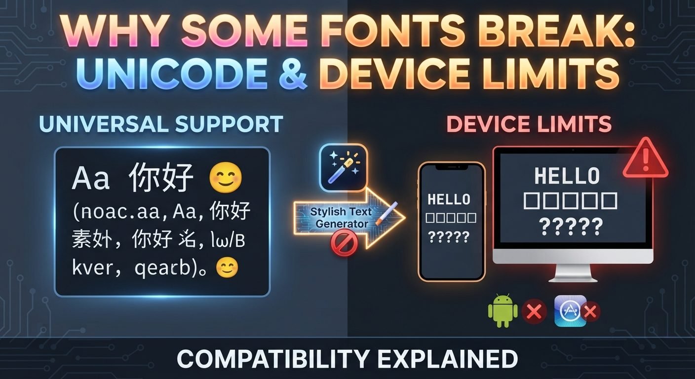
Those characters must be supported by the software and fonts used by the device.
If a character is not supported, the viewer may see a missing-character box or another unexpected symbol.
Use More Common Unicode Characters
If you want better compatibility, choose styles based on characters that are widely supported.
There is no guarantee that every character will look identical everywhere, but avoiding extremely obscure symbols can reduce potential problems.
A simple style such as:
𝐍𝐨𝐯𝐚
may be more practical than a design containing many unusual Unicode symbols.
When compatibility matters, simplicity is usually helpful.
Keep Your Username and Display Name Separate
If you are creating a stylish social media identity, you do not necessarily need to make every part of your account decorative.
For example:
Display name: 𝑺𝒊𝒍𝒗𝒆𝒓 𝑵𝒐𝒗𝒂 ✦
Username: @silvernova
This provides a stylish visual identity while keeping the account identifier simple.
The display name can focus on appearance.
The username can focus on searchability, typing, and recognition.
Choose a Consistent Style
Mixing several unrelated Unicode styles can reduce readability.
For example, using one decorative style for the first word, another for the second, and a third for individual letters creates visual inconsistency.
Instead, choose one main style.
For example:
𝑴𝒐𝒐𝒏 𝑺𝒌𝒚
Then, if desired, add one small decorative symbol:
𝑴𝒐𝒐𝒏 𝑺𝒌𝒚 ✦
The overall result remains visually organized.
Keep Decorative Symbols Away From Important Characters
If a symbol touches a letter too closely, the two elements may look like one character.
For example, brackets, stars, or lines placed directly around individual letters can make the word harder to recognize.
Instead of decorating every letter, place symbols around the entire name.
For example:
✦ Nova Sky ✦
can be easier to understand than placing a symbol between every character.
Think About Accessibility
Readable text benefits everyone, but it can be particularly important for users who rely on assistive technologies.
Unusual Unicode characters may be interpreted differently by screen readers and other accessibility tools.
If the text contains important information, ordinary characters are generally safer.
For decorative names, you can use stylish characters while keeping essential information elsewhere in normal text.
For example, a profile could have a decorative display name but a standard username and readable biography.
Avoid Stylish Text for Important Instructions
If people need to understand information quickly, normal text is usually the better choice.
For example, avoid using complicated Unicode styles for:
- Emergency instructions
- Password guidance
- Contact details
- Navigation
- Safety information
- Technical instructions
- Important announcements
Decorative text is best treated as a visual element rather than a replacement for ordinary readable writing.
Make Stylish Text Work With Your Brand
If you are creating a creator, gaming, business, or personal brand, consistency can be more useful than extreme decoration.
Choose a style that matches the overall appearance of your profile.
For example, a clean technology account might use:
𝐏𝐢𝐱𝐞𝐥 𝐍𝐨𝐯𝐚
A creative account might use:
𝓟𝓲𝔁𝓮𝓵 𝓝𝓸𝓿𝓪
A minimalist account might simply use:
Pixel Nova
The important part is that the name feels connected to the rest of the profile.
A Simple Readability Test
You can evaluate any stylish name with five questions:
1. Can I Read It Immediately?
If not, simplify it.
2. Can I Recognize Each Word?
If letters merge together, choose another style.
3. Does It Work on a Phone?
Check the smallest practical display size.
4. Does It Work Without Zooming?
If you need to enlarge it, the style may be too complicated.
5. Can Someone Remember the Base Name?
The actual name should remain more memorable than the decorations.
Common Mistakes to Avoid
Using Too Many Symbols
Excessive decoration can hide the name.
Choosing Extremely Thin Characters
Thin characters may become difficult to see on smaller screens.
Using Unusual Unicode Characters Without Testing
They may not display correctly everywhere.
Styling Long Paragraphs
Decorative text becomes tiring to read when used for large amounts of content.
Ignoring Mobile Users
A design that works on a desktop may not work on a phone.
Mixing Multiple Styles
Too many different character styles create visual clutter.
Forgetting Searchability
A stylish name may be harder to search if its characters are very different from ordinary letters.
Making Every Element Decorative
You do not need to style every letter, word, and symbol to create an attractive result.
How each style holds up at the size it will be read
A style that looks good in a generator is being shown far larger than it ever will be in a profile. This is how the families hold up where the text is actually small.
| Style | Example | Phone-sized name | Long bio line |
|---|---|---|---|
| Bold | 𝗔𝗿𝗶𝗮 | Clear | Fine |
| Small Caps | ᴀʀɪᴀ | Clear | Fine |
| Serif Italic | 𝐴𝑟𝑖𝑎 | Clear | Tiring past a line |
| Script | 𝒜𝓇𝒾𝒶 | Slower to read | Avoid |
| Fraktur | 𝔄𝔯𝔦𝔞 | Hard | Avoid |
| Circled | Ⓐⓡⓘⓐ | Letters merge | Avoid |
| Double-struck | 𝔸𝕣𝕚𝕒 | Hard on low-resolution screens | Avoid |
Use the decorative families for a display name of one or two words, and keep anything someone has to read in quantity — a bio, a caption — in plain text or Bold.
Read also: → Small Text Generator — see how small still reads
Frequently Asked Questions
Why does stylish text look different on my phone and computer?
Different devices can use different operating systems, fonts, applications, and rendering systems. Unicode characters may therefore have slightly different appearances across devices.
Why do some stylish characters appear as boxes?
The device or application may not have a suitable font capable of displaying that particular Unicode character.
Is bold Unicode text easier to read?
It can be, depending on the characters and screen size. Moderate visual weight can improve visibility, but extremely heavy or unusual characters can still reduce readability.
Should I use stylish text in a long bio?
It is usually better to keep longer bios mostly in normal text. Stylish characters work better for short headings, names, or small decorative elements.
How can I make a stylish username easier to read?
Start with a simple base name, choose a readable style, limit symbols, avoid confusing characters, and test the result on both phones and computers.
Should I use a stylish username or only a stylish display name?
If possible, using a simple username with a stylish display name can provide a good balance. The display name can focus on appearance while the username remains easy to search and type.